The history of the Skoda logo - Skoda
What do Å brand codes look like? The brand has been so successful in our market that it's hard not to know it. Even the uninitiated will tie it up and probably say it's just a circle with something unidentified inside. So what is it and where did it come from? Good question!
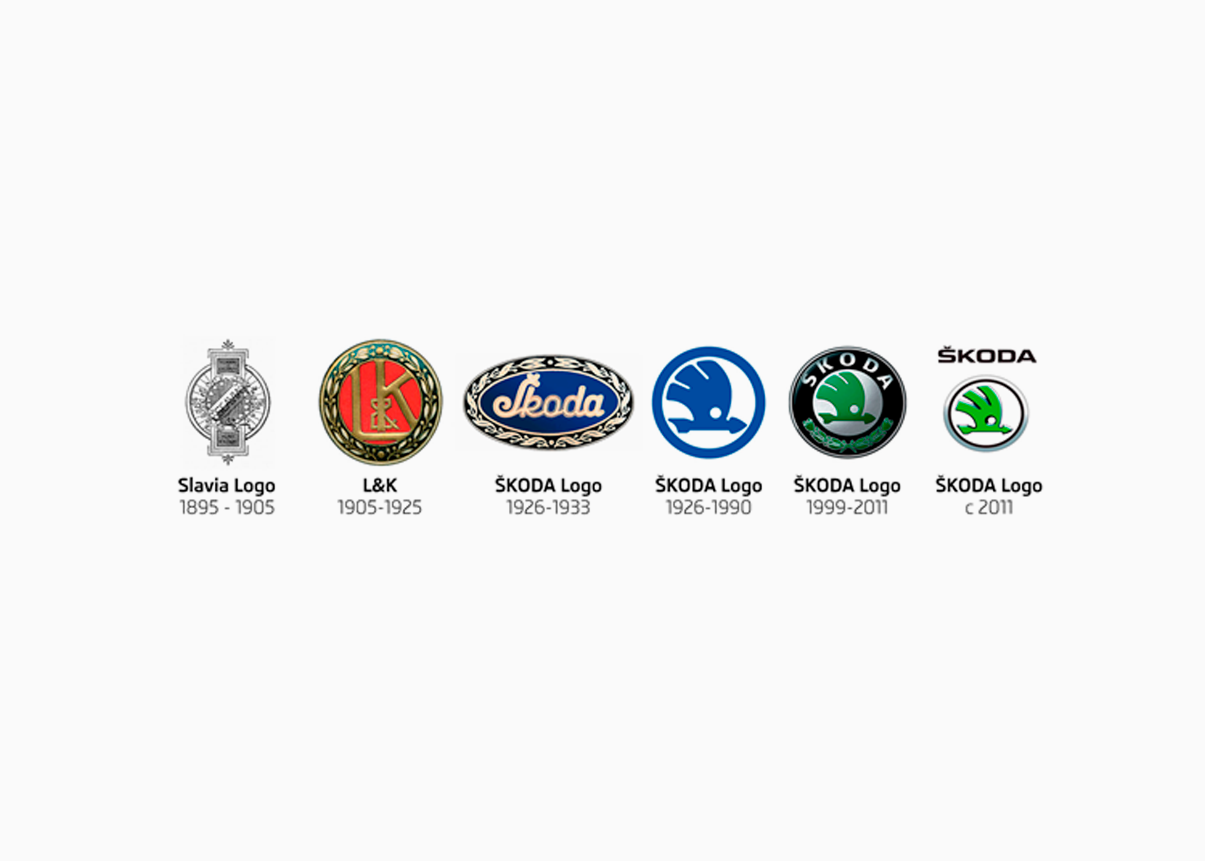
The Skoda emblem didn't look like it does today. Moreover, we can safely say that in the initial period he was more changeable and unpredictable at concerts than Madonna. It all started in 1895. Then the manufacturer did not think about the production of cars - he preferred to please people with bicycles and motorcycles. Therefore, the first logo was a bicycle wheel with linden leaves woven between the spokes. Of course, it was not without symbolism - the role of the wheel does not need to be explained, and the lime emphasized the Slavic origin of the brand. In today's minimalism, probably no one in their right mind would release such a complex emblem, but then - you could attach a small work of art to a bicycle or motorcycle. Exactly at the same time, another trademark was available - a pretty masculine woman with a scythe and linden leaves. This, in turn, hinted at the Art Nouveau style.
The time for change came 10 years later, in 1905. The emblem of Slavia, which used to be a bicycle wheel, has now become a gingerbread. Exactly! Even unofficially, it was referred to as such because of its characteristic shape and color. In addition, this time it was dedicated exclusively to motorcycles. On the other hand, the Laurin & Klement logo, a specific woman with a scythe, was greatly simplified because the company decided to go into cars. The initials of the founders, entwined with laurels, ended up on the hood of the Voiturette A car.
Everything changed again in 1913. The discreet round L&K emblem was replaced by a huge oval stylized logo consisting only of the names of the owners - Laurin & Klement. You could meet them in a G-type car and advertise the brand all over the estate. This period was interesting for another reason. Å koda Pilzno — yes, there was already a company that took over L&K. Initially, Åkoda had no registered logos, so they used the letters "Å" or "Å Z" in a circle - without any excessive embellishments or additions. They looked ugly because the design tender was probably announced back in kindergarten, but the real logo revolution was yet to come.
In 1923, a logo appeared that really marked the direction in which the Åcodes trademark would subsequently go. Allegedly nothing - an Indian with a plume, a hooked nose and an erroneous look was heading somewhere far up. However, it was not about the Indian himself, but about what he had on his head and what he was associated with - a bow under his arm, arrows behind his back and a cry that he carried throughout America. At the end of 1923, a brand was registered that is still used today without any major changes - a blue, winged, probably Indian arrow, inscribed in a circle. As if that wasn't enough, she also had something like an eye. The best part is that it is still unknown who came up with such a strange idea, who approved it and where the inspiration came from. Maybe not from a screaming Indian? One thing is for sure - the logo stuck, unlike the second trademark introduced a little later, in 1925. The golden word "Akoda" is presented on a dark blue oval and surrounded by a golden floral motif. It could be seen in code 633, but was finally removed in 1934. The winged arrow became recognizable.
The distinctive emblem was first updated in 1993. This is an important date - Åkoda has financial problems, and Volkswagen is in the dark with a large amount in the account. For this, he wanted to share it. The code was adopted and the logo was changed - blue replaced the juicy green, and the new name of the plant - Åkoda Auto - appeared on the bold ring. After all, it didn't last very long.
A year later, it was possible to admire the new emblem of the manufacturer, although the changes were small - the ring became black, and the inscription "Auto" was replaced with laurel. However, this little "piece of nature" was not to the taste of everyone in the company, because suddenly it was changed back to "Auto". However, the new colors of the logo remained, and, finally, a new chapter in the history of the brand had to be marked, as the first car produced in cooperation with Volkswagen, Felicja, appeared in car dealerships. True, the distinctive logo design was created a long time ago, but it was in the 90s that people began to wonder if it was possible to rewrite the symbolism into individual elements of the emblem. And what - he has a Mercedes, is it Akoda? The area has become identified with the globe and the wide range of the brand. A wing with a rich offer and technical progress, as well as a shot with innovation and the precision of the choice made. Mainly due to the fact that Volkswagen got into the center even blindly. There is also an eye - prudence, and green color - environmentally friendly production. Is there anything else I can change about the logo?
Of course, stylists are creative. In 1999, the look of the emblem was refreshed, but this time in the printed version, shadows were added, thanks to which it all became optically convex. Not everyone knows that in 2005 the manufacturer celebrated its 100th anniversary on the market. And there was something to celebrate - the production of bicycles and motorcycles, then cars, financial problems, a debit card with a pin code for a Volkswagen account, and, finally, a big success. This needed to be celebrated, so the anniversary logo appeared - a green ring, laurels returned, and the inscription "100 YEARS" took the place of the winged arrow. However, the cars had more marketing than practical applications. A new era in brand symbolism begins now - in 2011.
From March, the new emblem will be displayed on the brand's internal and external media. Because the strength of things, the showcase of today is minimalism and children, who instead of: “mother” shout: “mp3” - the logo has been significantly modernized and simplified. The green arrow looks like it's carved from a metal plate, with a thin chrome circle around it with the words "Å koda" above it. And that's just the beginning - from 2012, all new models will feature a brand new silver logo. Well, the world is changing, and the logo is changing with it. And to think that it all started with a male woman and a bicycle wheel...