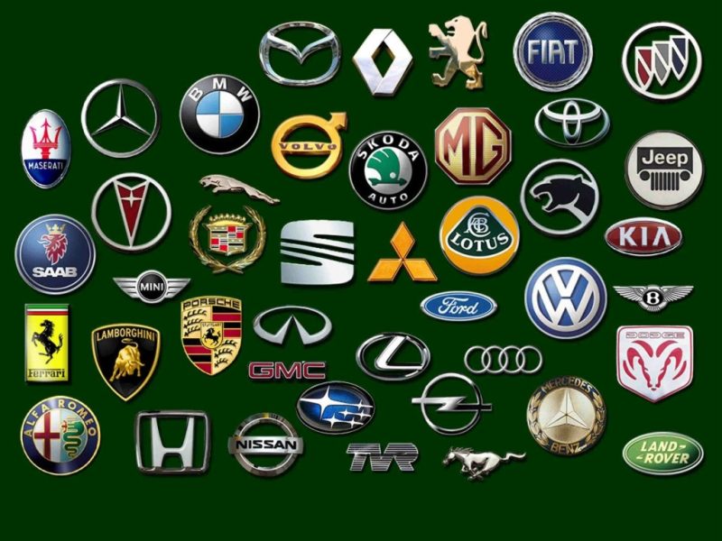
How did the logos of famous brands of racing cars evolve?
The symbol that undoubtedly distinguishes every brand manufacturer is its own unique logo. Thanks to this, in a fraction of a second, looking only at the badge on the hood, we can recognize the car of a particular manufacturer. It usually contains elements related to the company, its history and the beginning of its activities. Just as the look of cars changes, so does the design of the logo, as well as the font or shape used. This procedure makes the symbol more modern, however, it should be recognized that these changes are usually minor and planned enough to allow the user to associate the symbol with the vehicle brand without any problems. So let's take a look at how famous racing car brand logos have evolved over the years.
Mercedes
One of the most recognizable logos in the world is the famous "star" assigned to Mercedes. The founder of the company - Gottlieb Daimler in 182 drew a star on a postcard addressed to his wife, explaining to her that one day he would rise above his factory and bring them happiness and prosperity. The star has 3 hands, because Daimler planned the development of the company in three directions: the production of cars, aircraft and boats. However, this did not immediately enter the company logo.
Initially, only the word "Mercedes" was used, surrounded by an ellipse. The star appeared in the logo only in 1909, at the request of Gottlieb's sons, after his death. It was originally golden in color, in 1916 the word "Mercedes" was added to it, and in 1926 a laurel wreath, previously used by the Benz brand, was woven into the logo. This was the result of a merger between both companies. In 1933, a minimalistic look was restored - a thin black star remained without any inscriptions and additional symbols. The modern trademark is a thin silver three-pointed star surrounded by an elegant rim. Anyone who would like to see the logo with their own eyes and try out the iconic Mercedes is invited to take a ride behind the wheel or in the passenger seat. Mercedes AMG.
BMW
The BMW logo was inspired by the trademark of Rapp Motorenwerke, a concern owned by Karl Rapp, one of the founders of BMW. Years later, it was decided that inspiration should be sought at the beginning of the company's creation, when it specialized in the production of aircraft. The logo was supposed to have rotating staggered propellers, the colors of the Bavarian flag. The BMW badge has not changed significantly over the years. The color of the inscription and the font have been changed, but the shape and general outline have remained the same over the years. Test Potential BMW E92 Performance on one of the best racing tracks in Poland!
Porsche
The Porsche logo is based on the coat of arms of the People's State of Württemberg during the Weimar Republic and Nazi Germany. This is the coat of arms that operated in these regions even before the Second World War. It has deer antlers and black and red stripes. A black horse, or actually a mare, is added to the coat of arms, depicted on the coat of arms of Stuttgart, the city where the plant is located. Porsche. The company logo has remained practically unchanged for many years. Some details were only smoothed and the color intensity increased.
Lamborghini
The logo of the Italian concern Lamborghini has also not changed over the years. Founder - Ferruccio Lamborghinithe zodiac bull chose this animal to identify his brand. This was also aided by his love of Spanish bullfighting, which he saw in Seville, Spain. The colors are quite simple, the logo itself is minimalistic - we see the coat of arms and the name written in a simple font. The color used was gold, symbolizing luxury and wealth, and black, symbolizing the elegance and integrity of the brand.
Ferrari
Car enthusiasts recognize the Ferrari logo as the world's most popular car brand icon. We see a black horse kicking against a yellow background, with the brand name below and the Italian flag above. The horse appeared on the symbol at the insistence of the parents of the Italian hero, Count Francesco Baracca. He fought in the Italian Air Force in World War I. He was an extremely talented Italian pilot who painted a black horse on the side of his plane, which was the coat of arms of his family.
In 1923, Enzo Ferrari met Baracchi's parents at the Savio circuit, who, overjoyed at their victory in the race, invited them to apply the logo that their son had once used on their cars. Ferrari complied with their request, and 9 years later, the badge appeared on the hood of the Scuderia. The shield was canary yellow, which was supposed to symbolize Modena - Enzo's hometown, as well as the letters S and F, denoting Scuderia Ferrari... In 1947, the symbol underwent minor changes. Both letters were changed to Ferrari and the colors of the Italian flag were added at the top.
As you can see, the logos of famous brands of racing cars have evolved at different rates. Some companies, such as Lamborghini, have opted for tradition, opting not to interfere with the logo designed by the main creator. Others, over time, have modernized their symbols to better fit in with current trends. However, it should be recognized that such a procedure often divides consumers into supporters and opponents of a new design.