How to combine colors in the interior?
Content
Colors are of great importance in interior design and the harmonious composition of space. Properly placed, they can optically enlarge or reduce a room, make it more cozy and intimate or cool. Colors also affect mood, they can inspire action. See different ways to combine colors. Proven rules will help you choose them, which should be followed when arranging the apartment of your dreams.
How is color produced?
Before proceeding with the combination of colors, it is worth considering what color is and how it is obtained. What we see is the image that forms in the brain when light reflected from the object we are looking at enters the eye. Thus, color is not an objective characteristic of light, but only a subjective sensation that depends on the wavelength and sensitivity of the human eye, which reacts to three colors with different wavelengths: red, blue and green. These three colors, when mixed with each other, create new colors.
Colors can be perceived simultaneously in a similar and individual way, but within the framework of generally accepted norms. In the opposite situation, we can talk about color blindness, that is, incorrect discrimination of colors.
Hue, brightness and saturation
How we perceive a color also depends on its hue, brightness, and degree of saturation. What does it mean?
- color it is created by mixing three primary colors and subsequent derived colors. Depending on the proportions used, a completely different color can turn out. So you can get yellow, orange, purple, blue and many other colors.
- brightnessthat is, the intensity of the color depends on the amount of light entering the human eye. The full range of intensity for example red can vary from white (full light) to black (no light).
- Saturation subjectively determines the degree of distortion of the primary color by other colors. The degree of saturation of, for example, red represents various shades from red to grey.
Pure, primary and derived colors
- Pure colors are primary and derived colors.
- Primary colors can be defined as a set of three primary colors that cannot be obtained by mixing other colors. There are many theories for determining primary colors. One of them includes a set of colors known as RGB, which stands for Red-Red, Green-Green, and Blue-Blue. The RGB theory refers to the colors that the human eye responds to. However, in art and architecture, the set of yellow, blue and red is historically conditioned and most often used by designers and interior decorators.
- It is assumed that yellow, red and blue are a set of primary colors and can be obtained by mixing them together in the right proportions. complementary colorsi.e. green, orange, purple.
Color wheel - relationships between colors
Color circle is a practical tool that allows you to better understand the relationship between individual colors and the results of their combination. The first pie chart was created by Isaac Newton. Experimenting with the diffraction of light by a prism, he came to the conclusion that any color can be obtained by mixing several so-called primary (primary) colors. In 1704, he published Optics, in which he published a color wheel showing the geometric relationship between primary colors and their derivatives.
Complementary colors are on opposite sides of the circle. By mixing opposite colors that cross the center of the circle, you will distinguish between white and black, which, in turn, when mixed will give gray. Thus, the color wheel is the main tool for combining colors, with which you will always get a satisfactory result by combining any color.
There are also colors associated with two types of emotions on the wheel. On the one hand, warm colors with active features, such as yellow, orange and red. On the other hand, there are cool colors like blue, purple and green.
How to combine colors using the color wheel?
The color wheel is the key to understanding color theory, knowledge of which plays a significant role in creating harmonious interiors. So how to use the color wheel in the interior?
- Creating contrasting combinations - by combining colors on opposite sides of the circle, you will get a strong contrast that allows you to emphasize a certain element of the arrangement. One of the classic and timeless combinations is a safe set of white and black that can be diluted with a distinctive color. It is worth emphasizing that almost every color is combined with white and black.
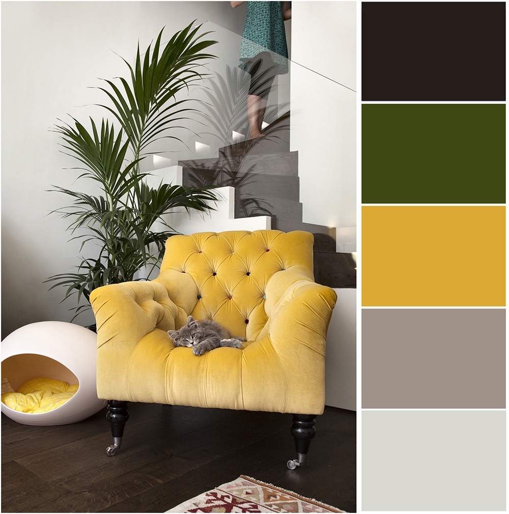
Another example of a contrasting combination is the combination of dark blue and mustard yellow, for example, mustard furniture against a dark blue wall. On the other hand, colorful duos like turquoise and orange or pink and yellow make for a bold and energetic color combination perfect for use as accessories.
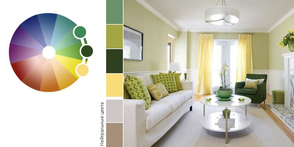
- A combination of related colors - if you appreciate the diversity of interiors, combine related colors, that is, colors located close to each other on the color wheel. Looking at the color wheel, it's very easy to see that blue pairs well with purple and blue. On the other hand, lovers of warm but muted tones will love the trio of light green, yellow and orange, which is often found in vintage arrangements.
- Monochrome combinations - obtaining a uniform arrangement is increasingly used by interior designers. No wonder the coordinated colors look elegant and comfortable. How to create a monochrome color scheme? All you have to do is combine different shades of the same color. For a bright, muted interior, choose white, ivory and sandy beige. In this way, you can paint the walls, pick up furniture, as well as accessories that are combined with the rest of the decor. Another equally interesting way to create a monochrome and elegant arrangement is a set of colors in the form of dirty pink, burgundy and dark chocolate with a hint of purple. On the other hand, a set of white, gray and complementary metallic decor will appeal to fans of minimalism.
Tips for choosing colors in interior design.
The following tips will also help you in the right combination of colors:
- Bright, warm colors visually expand the space, as they have the ability to reflect light. Necklaces of dark and cold tones visually narrow the room. Arrangement trick: In a long, narrow room, you will change the proportions if you paint the shorter wall a darker color.
- When choosing different colors for the interior, remember the similar saturation, so that the composition will turn out to be more harmonious.
- In the arrangements you create, enter the main color, which should be complemented by no more than 4 colors. This is how you avoid chaos.
- When deciding on wallpaper and color on the walls, make sure that the shade of paint matches the color of the wallpaper.
- The amount of light entering the eye is also important for color perception. The less it reaches, the darker the color becomes. Arrangement trick: Matte surfaces absorb more light, making the space optically smaller, while smooth, shiny surfaces reflect it much more, i.e. visually enlarge.
The psychology of color - the meaning of colors in interiors
The power lies in the color, so when choosing a color for your interior, remember that each color has different properties. According to the psychology of colors, individual colors can be assigned different meanings:
- Biel: A light color that can have both warm and cold tones. It has a calming effect, but if used excessively, it can give the impression of isolation. That is why it is worth supplementing it with other colors, which will significantly deepen the white. White is one of the popular colors used in modern arrangements, especially in Scandinavian style.
- Gray: Like white, has a calming effect and helps to achieve balance. It is a universal color against which every color looks great. However, too much gray can make you depressed. It is most often found in interiors decorated in Scandinavian style (light gray shade), as well as in modern interiors (dark gray shade).
- beige: This is a calm, good mood and soothing color. Beige is a versatile color that looks good in any room. Shades of beige combined with gray and luxurious accessories are a successful recipe for a relaxing classic interior.
- brown: Among the flowers of the earth raw, mature. It is a great background for other colors and makes the interior more comfortable.
- Green: Associated with nature, it has wonderful therapeutic power. It promotes creative thinking, adds optimism, relaxes and brings relief in stressful situations. It has many shades. Bright greens will appeal to lovers of expressive colors. On the other hand, muted or cold ones balance the composition.
- Yellow: associated with optimism and joy, gives energy. This color also promotes creativity and encourages action.
- red: Energetic, bold, emotional, inciting to action. In excess, it can cause aggression. It's a color for the bold, so it's best to use it in moderation as supplements.
- pink: Associated with empathy, friendship and sensitivity. Soothing and soothing, well suited in bedrooms, ladies' bathrooms and girls' rooms.
- violet: Elegant, dignified and luxurious, most often associated with spirituality. It has a positive effect on the nervous system, but in sensitive people it can cause melancholy and depression.
- blue: Gloomy, symbolizing melancholy and infinity. It is a cold color, the excessive use of which can cause sadness. Blue also suppresses appetite, so it is not recommended for the kitchen and dining room. Perfect as a color accent in the form of a single painted wall and accessories.
- the black: Associated with mystery and dignity, but in Western culture is equated with mourning. It optically reduces the room, and when used in interiors on small surfaces, it will emphasize the intensity of neighboring colors. An expressive graphic effect is created by a contrasting combination of white and black.
The colors that we surround ourselves with are very important for achieving a certain mood. Therefore, correctly selected colors play an important role in interior design. Thanks to the above tips, you can easily get interesting and unexpected color combinations in your houses and apartments. If you are interested in other interior design tips, follow our section I decorate and decorate, and you can purchase specially selected appliances, furniture and accessories in the new AvtoTachki Design zone.